
Case study / Skincare and beauty
Plumelle
A storefront that lets shoppers see every shade on skin before they buy.

Studio brand - designed and built by Wetals Studio.
01 / The brief
Shade is the whole sale.
Clean skincare and sheer tints sell on texture and shade, and shoppers can't swatch anything online. Plumelle needed a calm, premium storefront that shows every tint on real skin tones and every texture up close, so shoppers pick the right shade the first time.
02 / Research
What the best beauty stores get right.
Shade finders sell the range
The strongest stores put a shade finder up front, with depth tiles that make a wide range easy to shop.
Calm pacing builds trust
One brand line, a model caption and an inset packshot do more than another busy carousel.
Mobile hides the swatches
Most stores bury swatches on mobile and push add to bag far down the page.
03 / Signature features
Three features built for this brand.
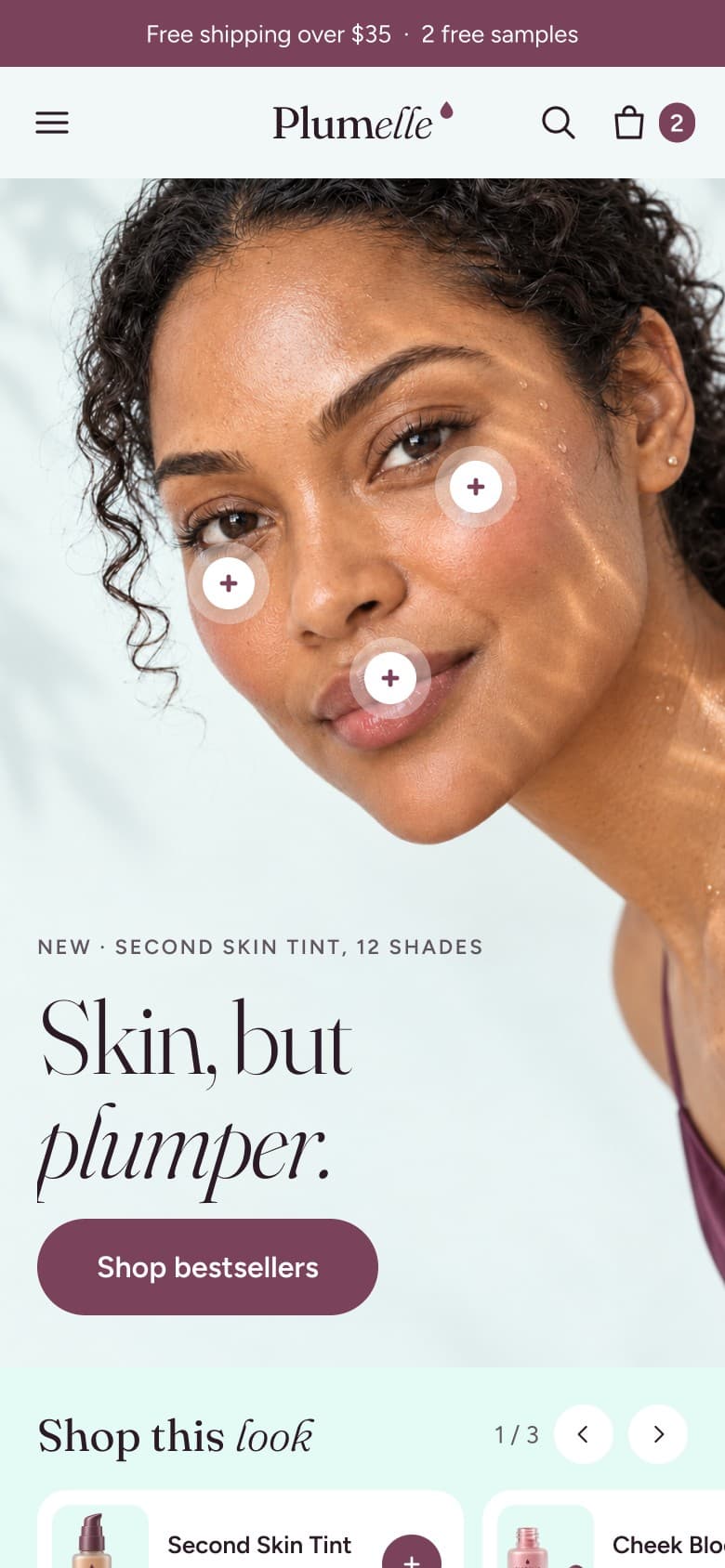
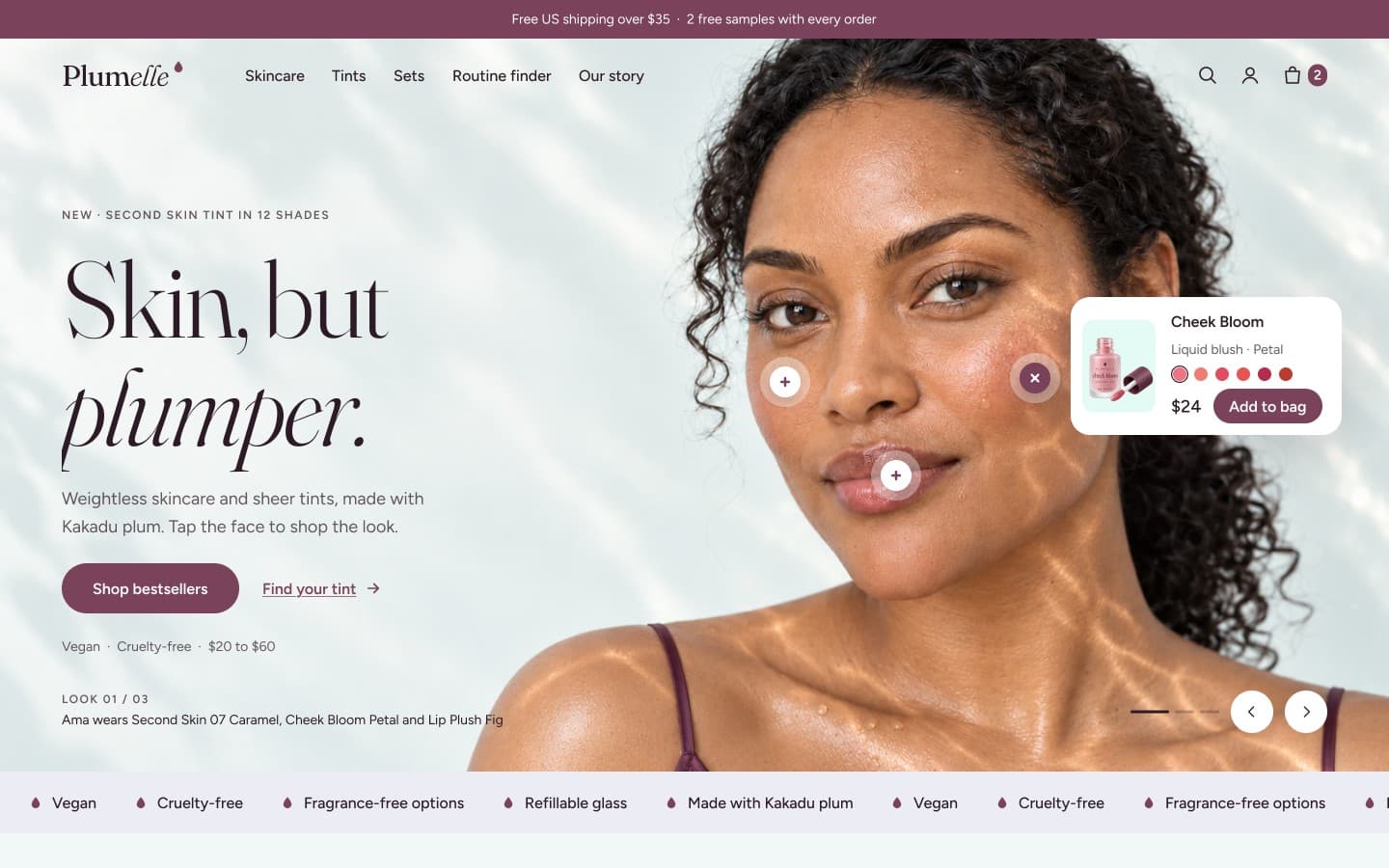
Shoppable face
Hotspots on the hero face open mini product cards, so shoppers buy the exact look they see.
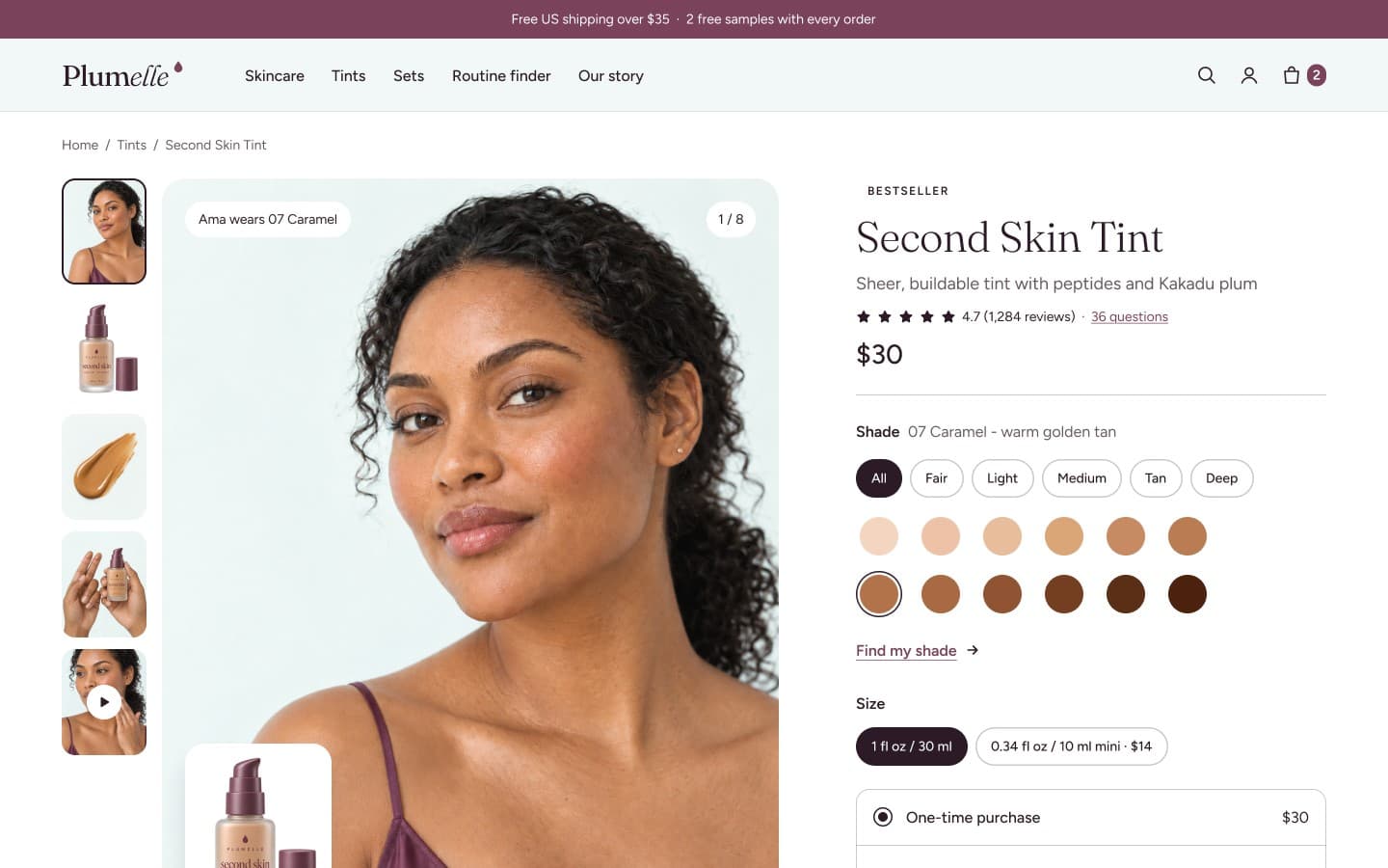
Shade finder
Pick a depth from fair to deep and see every tint on three skin tones in one strip.
Texture lab
Macro swatches show gel, serum, cream and tint side by side, so texture is never a guess.
04 / Design system
Soft color, editorial type, a light touch.
- Mint#BCF8EC
- Aqua#AED9E0
- Lilac#9FA0C3
- Mauve#8B687F
- Plum#7B435B
Plumelle
Plump skin, light touch.
Fraunces for display / Figtree for text
05 / Key screens
Homepage and product page.
Homepage / Desktop
Product page / Desktop
Homepage / Mobile
Next case study